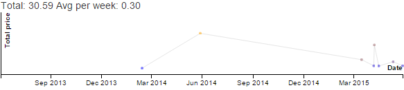
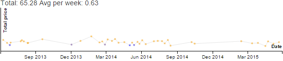
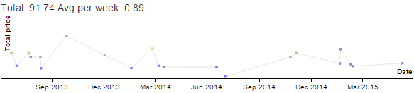
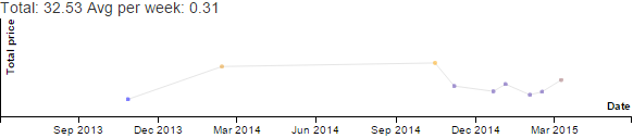
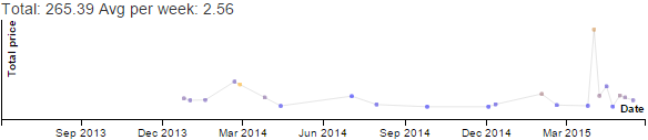
Discretionary - Productive - Emacs
category
over the past 11 years.
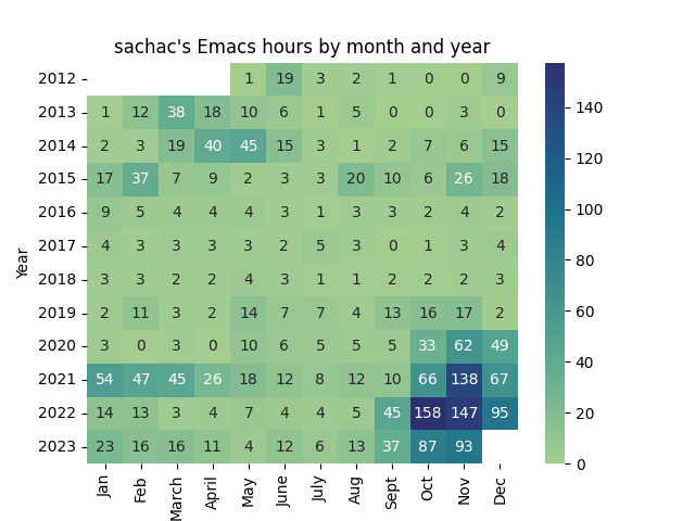
Year | Jan | Feb | March | April | May | June | July | Aug | Sept | Oct | Nov | Dec | Total |
---|---|---|---|---|---|---|---|---|---|---|---|---|---|
2012 | 0.7 | 19.4 | 2.7 | 1.9 | 1.2 | 0 | 0 | 8.6 | 34 | ||||
2013 | 0.7 | 12.5 | 38.5 | 18.5 | 10.0 | 6.0 | 1.2 | 5.2 | 0 | 0.1 | 3.2 | 0.4 | 96 |
2014 | 2.0 | 3.4 | 18.8 | 39.7 | 45.4 | 15.3 | 2.6 | 0.6 | 2.0 | 7.4 | 5.9 | 15.4 | 158 |
2015 | 16.6 | 37.4 | 7.4 | 9.0 | 2.3 | 3.3 | 3.2 | 20.0 | 9.6 | 6.3 | 26.5 | 18.2 | 160 |
2016 | 8.6 | 4.6 | 3.7 | 3.7 | 4.2 | 2.9 | 1.4 | 2.9 | 2.7 | 2.2 | 4.3 | 2.4 | 44 |
2017 | 3.7 | 2.7 | 3.2 | 3.2 | 3.0 | 2.0 | 5.2 | 2.8 | 0 | 0.9 | 3.4 | 3.8 | 34 |
2018 | 2.9 | 3.3 | 1.9 | 2.2 | 3.9 | 3.3 | 0.9 | 1.4 | 1.5 | 1.8 | 2.3 | 3.0 | 28 |
2019 | 2.2 | 10.7 | 2.6 | 2.3 | 13.7 | 6.8 | 7.1 | 3.6 | 13.3 | 16.1 | 16.7 | 2.0 | 97 |
2020 | 3.3 | 0.5 | 3.0 | .2 | 10.0 | 6.3 | 5.2 | 5.0 | 5.0 | 32.9 | 61.7 | 49.0 | 182 |
2021 | 53.7 | 47.1 | 44.7 | 25.5 | 18.1 | 11.5 | 8.3 | 11.9 | 9.5 | 66.0 | 138.1 | 66.6 | 501 |
2022 | 13.5 | 13.4 | 3.1 | 3.9 | 7.0 | 4.5 | 4.2 | 5.1 | 45.4 | 157.5 | 146.6 | 95.3 | 500 |
2023 | 23.4 | 15.9 | 16.2 | 11.2 | 4.4 | 11.5 | 6.5 | 13.3 | 36.6 | 86.6 | 93.2 | 319 |
Notes:
I can visualize this as a heatmap with:
import numpy as np import pandas as pd import matplotlib.pyplot as plt import seaborn as sns df = pd.DataFrame(time_data[1:], columns=time_data[0]).drop('Total', axis=1).set_index('Year') df = df.apply(pd.to_numeric) plt.title("sachac's Emacs hours by month and year") plot = sns.heatmap(df, annot=True, cmap='crest', fmt='.0f') fig = plot.get_figure() fig.savefig('emacs-time.png')
Activity | Jan 2023 | Feb 2023 | Mar 2023 | Apr 2023 | May 2023 | Jun 2023 | Jul 2023 | Aug 2023 | Sep 2023 | Oct 2023 | Nov 2023 | Total |
A- | 39.0% | 47.5% | 44.4% | 44.2% | 44.1% | 44.4% | 41.8% | 40.5% | 33.2% | 33.3% | 34.3% | 40.6% |
Business | 1.3% | 0.5% | 3.5% | 1.9% | 3.8% | 2.8% | 3.5% | 7.0% | 8.8% | 1.9% | 1.7% | 3.3% |
Discretionary > | 10.8% | 3.9% | 4.5% | 6.0% | 6.6% | 8.3% | 6.9% | 6.2% | 8.8% | 14.5% | 16.1% | 8.4% |
Personal > | 10.1% | 10.2% | 11.7% | 10.4% | 9.3% | 8.8% | 9.9% | 8.4% | 9.4% | 10.6% | 11.9% | 10.0% |
Sleep | 34.6% | 35.4% | 32.9% | 34.9% | 33.4% | 32.1% | 34.1% | 34.7% | 33.9% | 35.7% | 33.4% | 34.1% |
Unpaid work > | 4.3% | 2.5% | 3.0% | 2.8% | 2.9% | 3.6% | 3.9% | 3.3% | 5.9% | 4.0% | 2.6% | 3.5% |
Notes:
Sleep over the years:
Year | Jan | Feb | March | April | May | June | July | Aug | Sept | Oct | Nov | Dec |
2013 | 36.0% | 34.9% | 37.0% | 36.5% | 32.5% | 35.8% | 37.4% | 43.1% | 37.9% | 36.9% | 37.8% | 34.5% |
2014 | 36.4% | 38.2% | 37.0% | 36.7% | 35.0% | 37.6% | 37.8% | 34.7% | 36.1% | 34.3% | 41.3% | 37.4% |
2015 | 35.5% | 35.3% | 38.5% | 35.0% | 35.1% | 39.7% | 36.9% | 40.1% | 40.3% | 37.4% | 37.8% | 41.4% |
2016 | 35.5% | 35.3% | 38.5% | 35.0% | 35.1% | 39.7% | 36.9% | 40.1% | 40.3% | 37.4% | 37.8% | 41.4% |
2017 | 38.2% | 35.9% | 34.3% | 35.1% | 33.0% | 30.8% | 32.6% | 27.2% | 26.5% | 32.8% | 34.0% | 29.6% |
2018 | 29.7% | 33.4% | 32.8% | 32.5% | 31.0% | 29.3% | 35.1% | 33.0% | 37.7% | 36.9% | 29.3% | 34.0% |
2019 | 33.2% | 34.7% | 35.3% | 35.6% | 33.9% | 30.4% | 32.0% | 32.9% | 35.7% | 34.6% | 33.1% | 34.4% |
2020 | 32.8% | 34.7% | 37.9% | 32.2% | 32.8% | 30.3% | 31.5% | 30.1% | 32.4% | 31.8% | 28.9% | 33.1% |
2021 | 28.6% | 30.1% | 34.6% | 33.3% | 31.6% | 31.8% | 36.1% | 33.6% | 35.1% | 34.7% | 32.5% | 32.4% |
2022 | 35.5% | 35.6% | 38.5% | 37.2% | 38.1% | 38.4% | 36.5% | 38.1% | 35.3% | 32.0% | 30.1% | 27.8% |
2023 | 34.6% | 35.4% | 32.9% | 34.9% | 33.4% | 32.1% | 34.1% | 34.7% | 33.9% | 35.7% | 33.4% | 35.2% |
import numpy as np import pandas as pd import matplotlib.pyplot as plt import seaborn as sns df = pd.DataFrame(data[1:], columns=data[0]).set_index('Year') df = df.applymap(lambda x: float(x.strip('%'))*24/100.0) plt.title("sachac's sleep hours per day by month and year") plot = sns.heatmap(df, annot=True, cmap='crest', fmt='.1f') fig = plot.get_figure() fig.savefig('sleep-time.png')
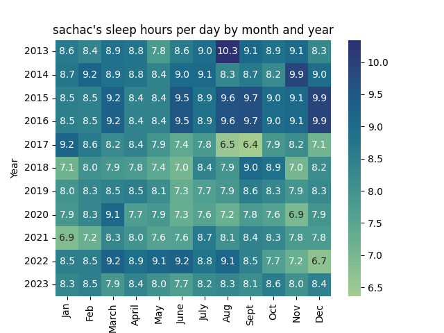
The kiddo was born in 2016. You can see how much less sleep I've been getting since then. =)
For example, here’s what clicking on the Track button will show:
I sometimes need to backdate entries, so tapping on Adjust gets me this screen:
When I have a little more time, I might tweak the interface a bit, but it will do for now. I’m glad I put this together. It makes time tracking something I can do even with a baby, yay!
All the reports in my blog posts are handled by Emacs Lisp functions that talk to quantifiedawesome.com and summarize my time data. You can find the code at https://sachachua.com/dotemacs and lisp/quantified.el .
I probably won’t be able to help anyone build a similar system any time soon, but maybe these notes can give you a few ideas. =)
]]>Clothes
I track my clothes to make it easier to simplify my wardrobe, and to guide my purchases.
I started by writing down dates and clothing combinations on an index card in the morning. Since my index card was unlined and my brain is pretty fuzzy early in the day, I occasionally had problems with incorrect dates or items not matching up. Eventually, I built a small Rails application (Quantified Awesome) to keep track of the clothes for me. Adding pictures made it easier to select the right item. Over time, I added little conveniences like the ability to display or sort by the last time I wore something.
I often find myself backdating entries, so maybe tracking my clothes isn’t as easy or as fun as it could be. I wonder if making it more prescriptive (“Pick one of these three outfits, or select what you’re going to wear”) would help, or maybe integrating it more into my morning routine.
Time
I track my time to guide my activity decisions and remind me of how I used the time.
I used apps on my phone to track time for a few months. I started with Time Recording and a few categories, adding more as I went along. When the number of categories got to be a bit unwieldy, I moved on to Tap Log so that I could organize the buttons into a menu. Since it didn’t have the built-in time analysis I liked about Time Recording, I added time analysis tools to Quantified Awesome. After I added other features to Quantified Awesome, I shifted to using it as my time tracking and analysis tool.
For a while, I tracked time by bringing up the Quantified Awesome web interface on my phone and typing in a substring of a category name. Then I decided to look into building Emacs integration so that I could automatically clock in from my to-do list. To speed up time tracking on my phone, I used Tasker to create a menu of my most common time categories. Since fiddling with Tasker on my phone was time-consuming and a little annoying, I eventually shifted to using Tasker and Javascript. That way, I could edit my HTML file in Emacs, copy it onto my phone through Dropbox, and get my handy menu of buttons. Using Tasker also allowed me to code extra behaviour such as turning off WiFi when I go for a walk.
My next step is probably to build more time visualizations so I can see the shifts from day to day, week to week.
Groceries
I track groceries so that I can make better decisions at the supermarket and so that I can get a sense of the balance and patterns of our consumption.
I started by typing in my receipts manually, but it was a little boring. I paid a virtual assistant to enter the data from my scanned receipts. This worked out to be better than the receipt scanning companies that were out there, since I could get line-item detail in a spreadsheet shared in Dropbox. I periodically reviewed the data, fixing errors and analyzing totals.
After some time doing this and quite a few errors in the data, I decided to build my own interface for entering data more reliably. Now that I’ve built my neat interactive interface, I find it faster (and more fun!) to enter the data in myself than to scan it and send it over. I’ve been digging into visualizing the data with D3 too.
Here’s a quick demo:
My next step is probably to build a grocery list interface for it. We’re currently using OurGroceries because it syncs well between my husband’s phone and mine, but I should be able to use either straight AJAX or WebSockets to get the synchronization part working.
So those are a few examples of how I slowly improve my tracking systems, rounding off rough edges and making things a little bit simpler for myself. Web programming is super helpful for me. Backend tools like Ruby on Rails allow me to build my own tracking tools and front-end tools like Javascript allow me to create personalized interfaces and visualizations.
I tend to code the next step of improvements only when something annoys me enough for me to do something about it or when a question makes me curious enough to want to investigate it. I’ve been deliberately working on my personal projects more often, though, and that might lead to more of these little improvements. We’ll see!
]]>For example, milk has different receipt item names depending on the item (size, brand, type) and the store. If I want to know how much we’ve spent on milk, I’ll use the total for all of them. But if I want to get a sense of the price history, it makes sense to track each receipt item type separately. I do this by keeping the receipt name (fixing typos as I review my data) and mapping these receipt names to a friendly name I set for myself. This way, the line “HOMO 4LI” on my receipt gets turned into “Milk” in my report. Come to think of it, maybe I should change it to “Milk, 4 L, Homogenized”…
Categories are handy for reporting too. Because of the ad-hoc way I created receipt item mappings and assigned them to categories, I ended up with inconsistent categorization. Some types of toilet paper were in the Supplies category, and some types were in the Other category. I manually reviewed the category assignments and I think I’ve gotten them sorted out.
Anyway, analyzing my data from 2013-07-01 to 2015-07-01, I see that we spend an average of $80 per week on groceries, which sounds about right. Some of the receipts are missing and there are almost certainly other little errors in the data, but this should give me the overall picture.
I’m still trying to figure out a good way to visualize the data in order to answer the questions I’m curious about, so here are my notes along the way. X axis is date, Y axis is total cost on that day, color is how it compares to the average price it is (lower price than average = blue, higher = orange).
Milk
Milk consumption is pretty straightforward. Every week, we use around 0.6 bags of milk (~2.4L) – more when J- and her friends are over (teenagers!). The price of milk has stayed at $4.97 per 4L, except for the time we bought a slightly more expensive type of milk (~Oct 2013) and the time in June 2014 when a smaller size was on sale, so we picked up one of those instead.
Eggs
We used to buy extra-large eggs, but the supermarket close to us stopped carrying 18-packs of those, so we switched to 18-packs of large eggs instead.
Extra-large eggs
Large eggs
The price of large eggs is stable at $4.27 for 18. We use ~11 eggs a week.
Things we buy when they’re on sale
Canned tomatoes
We stock up on canned tomatoes when they go on sale, since they’re easy to store.
We probably use ~3 cans a month. The sale price has drifted up from $0.88 to $0.97, while the regular price is a little bit over $1.50.
Butter
We haven’t bought butter at full-price in two years. The sale price for unsalted butter tends to be between $2.77 and $3.33, while the regular price is $6+.
Produce
Strawberries
I like strawberries, but I stopped buying them for a long time because they seemed like such an indulgence and the sweetness tended to be hit-or-miss. This year, I gave myself permission to splurge on strawberries in season.
Bananas
We seem to go through banana phases. When we hit banana overload, we stop for a while.
The colours here are just due to floating point imprecision. Bananas have actually stayed the same price for the past two years ($1.26/kg).
Apples
We often get gala apples:
We like picking up ambrosia apples during the rare occasions they’re available. Last winter was a good one for ambrosia apple availability.
Chicken
Whole chickens
Lots of whole chickens lately, because of the rotisserie.
Chicken quarters
Our main protein, although we also buy a fair bit of beef and pork, and chicken drumsticks/thighs when they’re on sale.
There’s more I haven’t explored yet, but I figured I’d put together these little observations along the way. =)
]]>
Here’s a screenshot:
On the left side, I have a scanned receipt in Autodesk Sketchbook Pro (or a paper receipt on the side). On the right, my autocompleting tracking interface. It’s not pretty, but it fits what I have in my head. I like the way that typing in the first few characters of the receipt line item is often enough to uniquely identify the receipt item type and retrieve the price history. This means that as I track, I also get a sense of the price trends and what a good sale is.
Aside from keeping track of the prices, I’m also looking forward to analyzing our consumption by category on a more regular basis. I did a few analyses along those lines before (here’s a year of data), but it might be neat to have that kind of feedback on a daily basis. Entering my receipt archive was easy. I ended up typing in the receipts from here to January because it was fun. =)
Next up: fast categorization, some graphing… I’m also looking forward to making a quick price book interface. Hmm, if I dust off that grocery list tool I had started building into Quantified Aweome and I integrate the price book, that might be handy.
]]>My current tracking system has two tiers. For my most-common activities, I use a custom menu that I can open from my phone’s home screen. I created the menu using Tasker. It’s easy to configure menu items to update my Quantified Awesome activity records as well as run other logic on my phone. For example:
One advantage of using something on my phone is that I don’t have to wait for the initial web page from Quantified Awesome to load. My keyboard occasionally takes a while to come up, too, so the menu-based interface gets around that as well. Also, as I get the hang of using Tasker, I can set up more intelligent processes. The menu has a link to open the web version, so if I want to track something less frequent, I can always use the web interface.
In the web interface, I usually type a substring to identify the category I want to track. For example, “kitch” results in an activity record for “Clean the kitchen”. I use this interface if I need to backdate entries (ex: -5m), too.
In addition to the two interfaces above, I’ve been thinking about taking advantage of the predictability of my schedule.
Research into adaptive menus turns up quite a few design ideas and considerations. Since I’m building this for myself, I can get around many of the challenges of adaptive interfaces, such as privacy and predictability. I’m curious about the following options:
Hmm… It might be interesting to play around with different menu options. It would be good to experiment with NFC as well, especially early in the morning. =)
Related:
I was thinking about the shape of my blog, too. I feel like I’ve shifted from a lot of technical posts to a lot of reflective posts. Possibly less interesting for other people, but useful to me. It’s hard to tell. These are the kinds of posts I’ve been starting to find useful in other people’s blogs, anyway, so who knows? Maybe these things are interesting for other people too.
It’s wonderful to be able to flip back through my archive and see the patterns over time. Of the 2,800+ posts in my index as of April 2015, I’d classify around 170 as mostly reflective. (Totally quick classification, just eyeballing the titles and categories in my index.) Here’s the breakdown:
Year | Reflections |
---|---|
2008 | 4 |
2009 | 9 |
2010 | 20 |
2011 | 7 |
2012 | 25 |
2013 | 20 |
2014 | 59 |
2015 | 25 |
Grand Total | 169 |
While writing a recent post, I searched my archives to trace the evolution of my understanding of uncertainty over several years. I can remember not having these snapshots of my inner world. When I reviewed ten years of blog posts in preparation for compiling Stories from My Twenties in 2013, I was surprised by how many technical and tip-related blog posts I skipped in favour of keeping the memories and the questions, and the sense of things missing from my memories. Maybe that’s why I wrote almost three times the number of reflective posts in 2014 as I did in the previous year. 2014 was also the year I switched the focus of my experiment from other-work to self-work, and that might have something to do with it too. I’m glad I have those thinking-out-loud, figuring-things-out posts now.
The end of April was around 33% of the way through the year, so I’m slightly ahead of last year’s reflective-post-density (expected: 20 posts, actual: 25). Comments are rare, but I’ve learned a lot from them.
I’m fascinated by the ten-year journals you can buy in bookstores. They give you ways of bumping into your old selves, noticing the differences. I like the way blogs give me a little bit more space to write, though. =) Here’s a slice of my life going through May 14:
I have shifted. I focus on different things. I like the direction I’m going in. I can imagine, years from now, getting very good at asking questions, describing and naming elusive concepts, and exploring the options. If it seems a little awkward now, that’s just the initial mediocrity I have to get through. Hmm…
]]>